PowerPoint slides convey not only the contents but also an impression of the presenter: sloppy,
organized, inconsistent, excellent, or confused. Wishing someone will love your
research without proper formatting is like wishing you’ll be loved by someone
special without washing your face, teeth, and body. Even if you have a good soul and perfect personality, you better brush your teeth when you wanna ask your love out. Just like this, it is a duty to have a neat
and concise format in your presentation format.
The beauty of the presentation format is you don’t need any
special talent. Small changes give a big positive impact. Low risk and high
return. It’s also beneficial for you. I’ve witnessed audiences who were so distracted by sloppy formats in their
students’ PowerPoint slides that they could not focus on the presentation
contents, and students could not get feedback for their research contents. It is sad and definitely avoidable.
The goal is to give concise and simple information with a
simple format. The following are five rules to follow.
5 Rules for PowerPoint Presentations
Rule 1. Include only one or two points of data in one slide.
Students often put too much data or thoughts in one slide. Be
concise. If you have multiple claims from one set of data, it’s better you
divide it over multiple slides. If you still have too many things to say, you need
to determine the most important claims for the context of your presentation and
focus on those instead.
Rule 2. Have a conclusion for the presented data.
Show your interpretation with a concise description. The audience wants to make sure that your interpretation is correct. Pick up several most important words, and describe the conclusion using the picked words (in other words, don't use many words in powerpoint slides.)
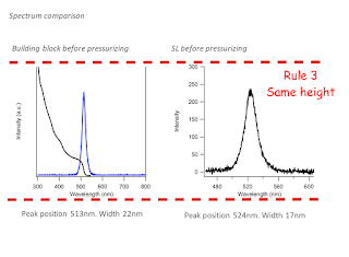
Rule 3. Presentation panels should be of the same height.
All the panels need to be the same height.


Rule 4. Add a figure title for each set of data (even if you
think it is obvious!)
It avoids confusion. Even
when it looks too obvious to you, it may not be so obvious for audience. So put the
title of the figure, such as “TEM image of gold nanocrystals” or “UV-Vis
absorption spectrum of CdSe quantum dots.”
Rule 5. Use the same font.
Use same font and size throughout your presentation. Changing
fonts looks tacky and is distracting.
Good
luck on your formatted presentation!


